How to teach with infographics in the ESL classroom
Multimedia and visuals are now the mainstay of any workplace which values employee engagement. The era of simple bar charts and graphs are being superseded by newer and more stimulating infographics. These brightly coloured and heterogeneous images have established themselves as a creative marketing, PR and education tool for displaying data. Using Google Trends you can easily see (below) the spike in interest for infographics over the last few years.
")
Inforgraphics are great way to encourage discussion, but for those learning English (think ESL, TEFL, ESOL, EAL and etc) even more so. Students who are perhaps struggling to find opportunities to simply practise their fluency and to share ideas amongst a group of differing nationalities and income groups, infographics offer that additional chance. The English language classroom requires extra effort to move away from methodical and
English language (ESL, TEFL etc) teachers can find infographics as a useful tool to; make information easily readable and contextualised, as it feeds our natural desire for visual stimuli, and allows students to interact with data in a far less intimidating way; but most importantly to allow students to guess and contextualise words and phrases.
In a business context, infographics can allow for individual creativity for presentations and encourages non-linear discussions, which could then allow participants to brainstorm (encourage thinking our loud) in a less obvious manner. There are many books on the subject:

The objective in many infographics is to facilitate ideas, prioritise information, categorise data and contextualise given data. Meanwhile discussions would thereby include data interpretation, logical formulation of ideas and grading sources from belonging to primary/secondary to measure trustworthiness.
A quality infographic would allow students to be rooted in data while exploring conceptual ideas. Any post discussion would stimulate a discussion led on evidence and challenging the rigor of data while challenging the preformed beliefs of others.
Choose the right infographic
As we everything in life, not all things are created equal. Choosing the right graphic can mean the difference between moving a class with you towards your goal or have them lagging behind incomprehensible statistics.
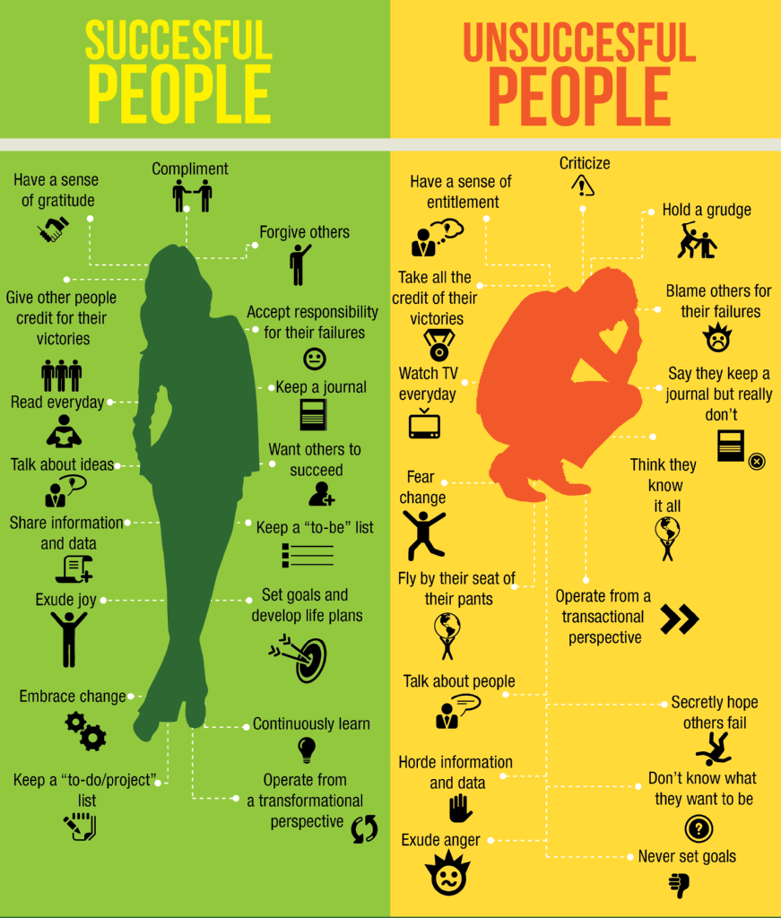
Avoid images that are data dense and are perhaps designed for a specific topics. For example:

A better infographic would be something that tries to summarise an industry, a market, a topic, a concept and provides a variety of graphics which can be discussed and categorised by learners.
Contextualise the topic.
Before introducing a subject or theme attempt to frame the class with appropriate media or guided questioning. You can use to following before you start with an infographic:
- Class/small groups brainstorm
- Venn diagram categorising
- Use video to introduce the context (youtube et al)
- Guided questioning “what you know about xyz?” etc
- Dictation of famous quotes on the subject
Introduce the graphic and draw conclusions
Have students view the graphic analytically in the follow ways:
- What elements work in the graphic?
- What are the key data points, are there drastic changes in the data?
- What data seems to be surprising or unsual?
- Does the graphic seems to show an obvious narrative? Is it contrarian?
- What is useful about putting information in this format?
- Why would this be better than just showing the formulas or using just a bar graph?
- What different pieces of information are included on this poster?
- What information was included in this poster that allows non-science people to understand the content?
- Write an abstract about what it is about (two or three sentences that highlights the purpose of the infographic.)
- Look at these examples and identify what you like/don’t like about each one.
- How are colors used differently in each one? Are some colors more powerful than others?
- How are objects displayed on each one? Do sizes of the objects matter in showing the intended information?
- How could colors, sizes, and kinds of objects be used to mislead people away from the data?
- Make notes about what you notice and like/don’t like about the infographics. you will be creating some throughout the year and these notes will remind you of what you visually like to see and will serve as a starting point for you.
Freedom to explore and and all ideas are encouraged and allow students to discuss together to come to a group conclusion
Extension ideas
With internet access allow students to search the internet for an infographic of their choice. Their task would be to present it (along with any other visuals) to a group and summarise the key ideas and concepts that lay within it. Before they begin they need to think about:
- Why is the selected infographic good for a presentation?
- What is the purpose of the visuals (charts, maps, drawings, etc) in this document?
- Is the text important for me to understand this infographic? Why?
- How can I evaluate this infographic? What does it do well? Where could it be improved?
- What information am I learning thanks to this infographic?
- Is this infographic helping me learn? How? Why?
Additional resources
- Piktochart (a presentation tool with templates that allow you to turn any kind of data into engaging infographics. You can modify color schemes and fonts, and upload basic shapes and images.)
- Easel.ly (web-based tool with dozens of customisable templates. They have a library with basic shapes, and you can change fonts, colours, text styles and sizes. You can also upload graphics and place them within the infographic.)
- Visual.ly (this is a community platform for data visualization and infographics that allows you to create infographics and to share them on social media.)
- InFoto (this site builds infographics from photos available on your Android phone.)
- Venngage (a tool that allows you to create and publish infographics. Templates, themes, charts and icons are available, and you can upload your own images as well.)
- Dipity (here, you can create, share, or embed content with interactive timelines. It lets you add video, audio, images, text, and links to social media for instance)
- Canva A wide range of templates with an easy -to-use interface. Currently free for everyone.
Further reading:
Taste: The Infographic Book of Food – ‘This book is packed with bite-sized pieces of fascinating foodie information, from cooking tips and nutritional facts to details of weird culinary traditions.’
Understanding the World: The Atlas of Infographics – This is an absolutely beautiful big book which operates on so many different levels. It is crammed full of information, on a huge range of fascinating different subjects, which is delivered to the reader in drop dead gorgeous graphic illustrations, mostly in full colour, and each unique.
Chartography: The Weird and Wonderful World of Infographics – Stephen Wildish has a habit of collecting everyday items and then presenting them to you in an easily digestible viewing experience. Take two tablets of Stephen’s art twice a day until symptoms subside.
An Infographic Guide to: London: pocket-sized edition – Welcome to the infographic guide to one of the world’s most visited cities: London! Discover all its hidden wonders, fascinating facts and famous landmarks through eye-popping infographics in this pocket-sized book. Includes a map of the city.
Infographic Guide to Music (Infographic Guides) – Fascinating, insightful, clever and stunning, these infographic diagrams will help you see music and the music industry in a whole new light.
Raw Data: Infographic Designers’ Sketchbooks – The book takes you straight into the pages of the designers’ sketchbooks. –Design Week
Infographic Guide To The Movies (Infographic Guides) – Fascinating, insightful, clever and stunning, these infographic diagrams will help you see movies and the movie industry in a whole new light.
If you feel this guide was helpful please do share, like and comment.


